Search result
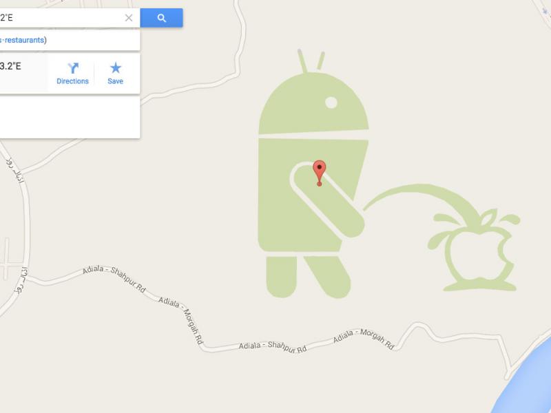
This is not a Prank or April's fool, it's a REAL thing.... A giant Green Android Robot urinating on the Apple logo appears on Google Maps, Go to this Link HERE and view Google Maps of "Rawalpindi, Pakistan" and you'll see the photo above.
We don't know who approved this photo from Google Maps Team... but it looks funny as hell. Also, note that the photo only appears in the traditional map view, and we'd hurry up if we were you. We doubt it'll be up there for very long.
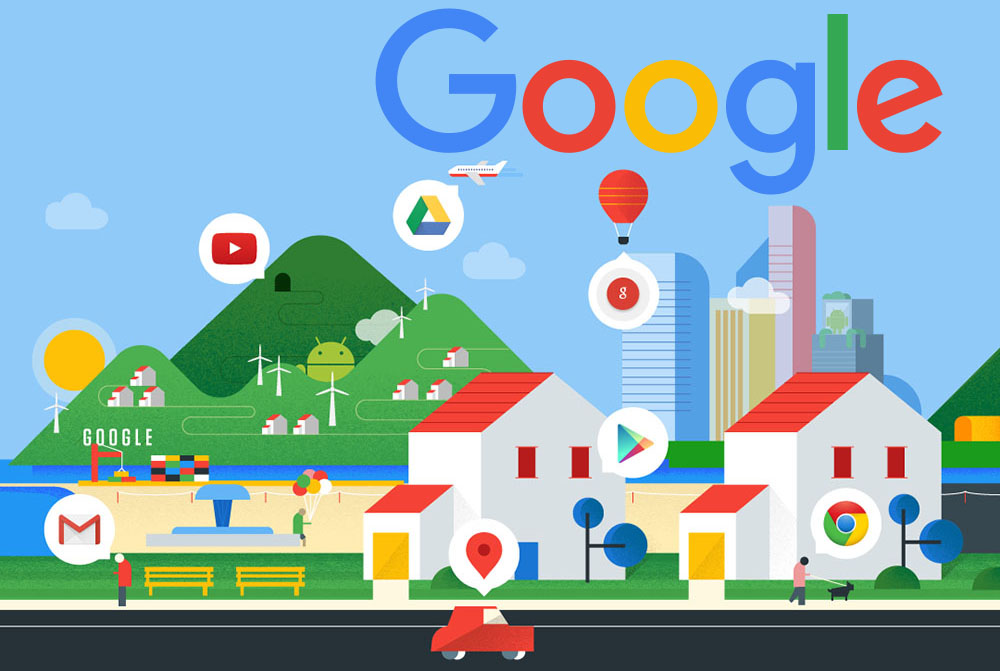
After changing Android's Design and Logo, Google is now changing its look and logo. Google's New Logo is flat with sharper angles and curves, you can already see the new "G" logo all over the company's official apps in the play store.
The new Google logo [picture below] is still a wordmark, but it's now using a sans-serif typeface, making it look a lot more modern and playful. The colors are also softer than they used to be. The logo bears a bit more resemblance to the logo of Google's new parent company, Alphabet, as well.

Alphabet's wordmark has a similarly unadorned look, and this update makes the two companies' design language fall more inline.

That was fast, just yesterday Google revealed its new Logo with an updated multi-colored shape. Today, the official Google App for Android has been updated to version 5.2 with changes to match the Google's new look.
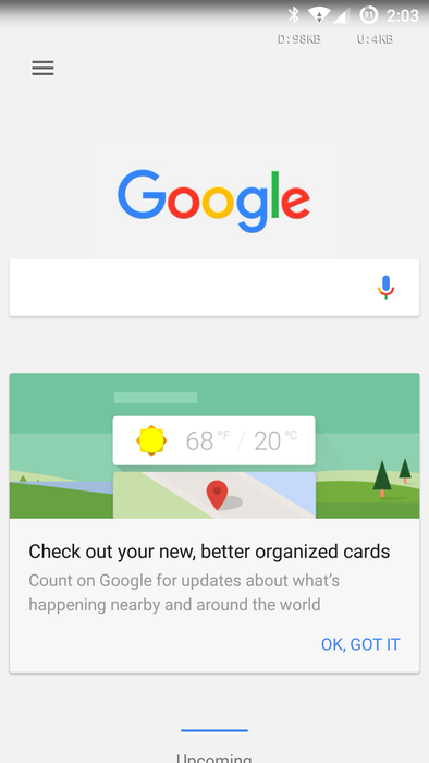
First thing you will notice is the new "G" Launcher icon that packs more colors than the plain old white icon. Google Now search screen also got updated with the a colorful Google logo, revamped User Interface, new cards design and new animation too.
Colors Everywhere... As you can see, there is now colors everywhere in the app, even the pop-up Google now icon.It's nice to finally see Google step out of the black and white world and try to be a little flashier.
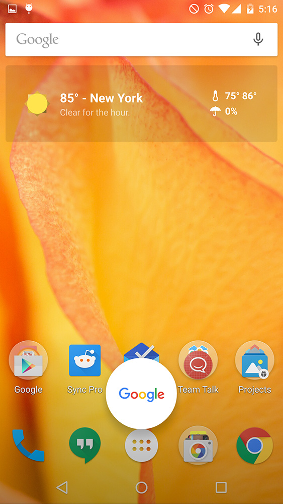
Google Search v5.2 change-log:
- New "G" app icon.
- Google new multi-colored logo is now in the search widget.
- Updated logo and font throughout the whole app.
- Updated Google Now UI.
- updated Cards design.
If you want to try out the New Google Now look, just install the APK below on your Android device (4.1+) and Enjoy!
![]()
![]()
Google's official YouTube App for Android has been updated to version 10.35.53 with some new features and a New improved Video Editor and some Chromecast bugfixes. The new feature will allow you to add music to the clips you upload, crop them, and add from a number of visual filters.
Other features include a redesign of the app's front page it is now separated in 3 tabs. The "home" tab displays interest-based suggestions; the "subscriptions" tab will give you a feed of all the channels you are subscribed to; and lastly, the "account" tab will give you access to your history, videos, notifications, and playlists. The "upload video" button can be found in the "account" tab.
The update also contains the vertical video tweak from now on, when you watch a video that has been shot vertically, going in full screen will not rotate the clip in landscape mode and squeeze it between two huge black bars. Instead, vertical videos will properly display in portrait mode on your phone.


That was fast, just yesterday Google revealed its new Logo with an updated multi-colored shape. The official Google App for Android has been updated to version 5.3 with more changes to match the Google's new look.

First thing you will notice is the new "G" Launcher icon that packs more colors than the plain old white icon. Google Now search screen also got updated with the a colorful Google logo, revamped User Interface, new cards design and new animation too.
Colors Everywhere... As you can see, there is now colors everywhere in the app, even the pop-up Google now icon.It's nice to finally see Google step out of the black and white world and try to be a little flashier.

Google Search v5.3 change-log:
- New "G" app icon.
- Google new multi-colored logo is now in the search widget.
- Updated logo and font throughout the whole app.
- Updated Google Now UI.
- Updated Cards design.
- Google Now On Tap working on M preview 3.
If you want to try out the New Google Now look, just install the APK below on your Android device (4.4+) and Enjoy!
![]()

Few days ago, Google revealed its new Logo with an updated multi-colored shape. The official Google App for Android has been updated to version 5.3.23 with more changes to match the Google's new look.

First thing you will notice is the new "G" Launcher icon that packs more colors than the plain old white icon. Google Now search screen also got updated with the a colorful Google logo, revamped User Interface, new cards design and new animation too. The update brings with it some new changes for the Google Now Launcher and a New app drawer.
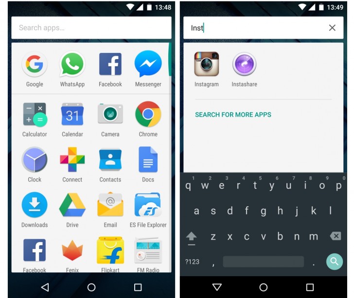
Colors Everywhere... As you can see, there is now colors everywhere in the app, even the pop-up Google now icon.It's nice to finally see Google step out of the black and white world and try to be a little flashier.

Google Search v5.3.23 change-log:
- New "G" app icon.
- Google new multi-colored logo is now in the search widget.
- Updated logo and font throughout the whole app.
- Updated Google Now UI.
- Updated Cards design.- Google Now launcher.
- New App drawer.
If you want to try out the New Google Now look, just install the APK below on your Android device (4.4+) and Enjoy!
![]()
Google Maps for Android updated to version 9.15.0 with some New features and Bug fixes and it's now rolling-out on the lay store. The update adds the new Google Logo and icons to the app, along with some new features with an ETAs across driving comparison, that shows a comparison list of all the roads you can take to reach your target.
"My Events" will show you a list of the event's locations you have from your Gmail, the app will also show you directions to the nearest event.
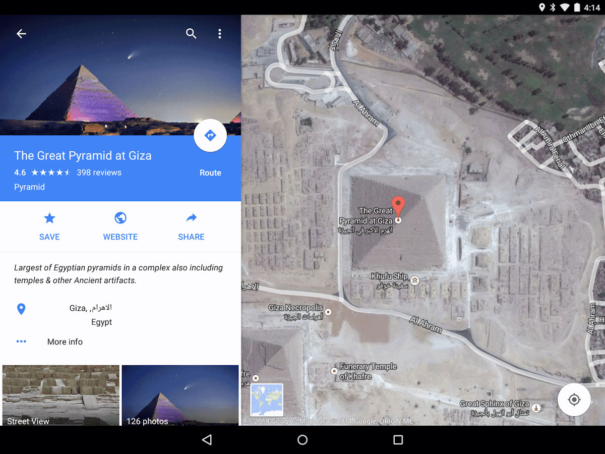
Google Maps 9.15.0 change-log:
• Easily compare ETAs across driving, transit, walking & biking
• Find the best places to eat & drink around you, with curated recommendations in San Francisco, New York & London
• New Google Maps logo
• Bug fixes
The Update is only available to Devices runing Android version 4.3 or later Only. If you don't want to wait until the update hit your device, You can Download the official Google Maps 9.15 APK from the link below.
![]()
Cyanogen Inc. is going through a complete re-branding, New concept, New Logo and even a New boot animation that will be included on all the company's upcoming custom Android ROMs.
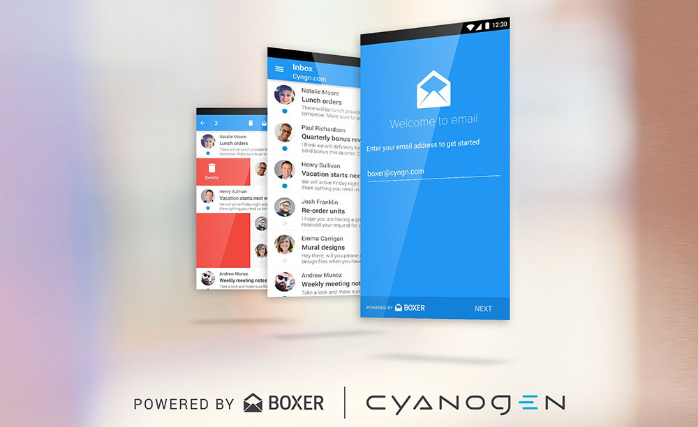
Cyanogen, today, showed a new boot animation that will be integrated with the upcoming Cyanogen OS 12 in a YouTube video that you can watch below. This version of Cyanogen OS is based on Android Lollipop and will include a number of new features headed by Project Volta.
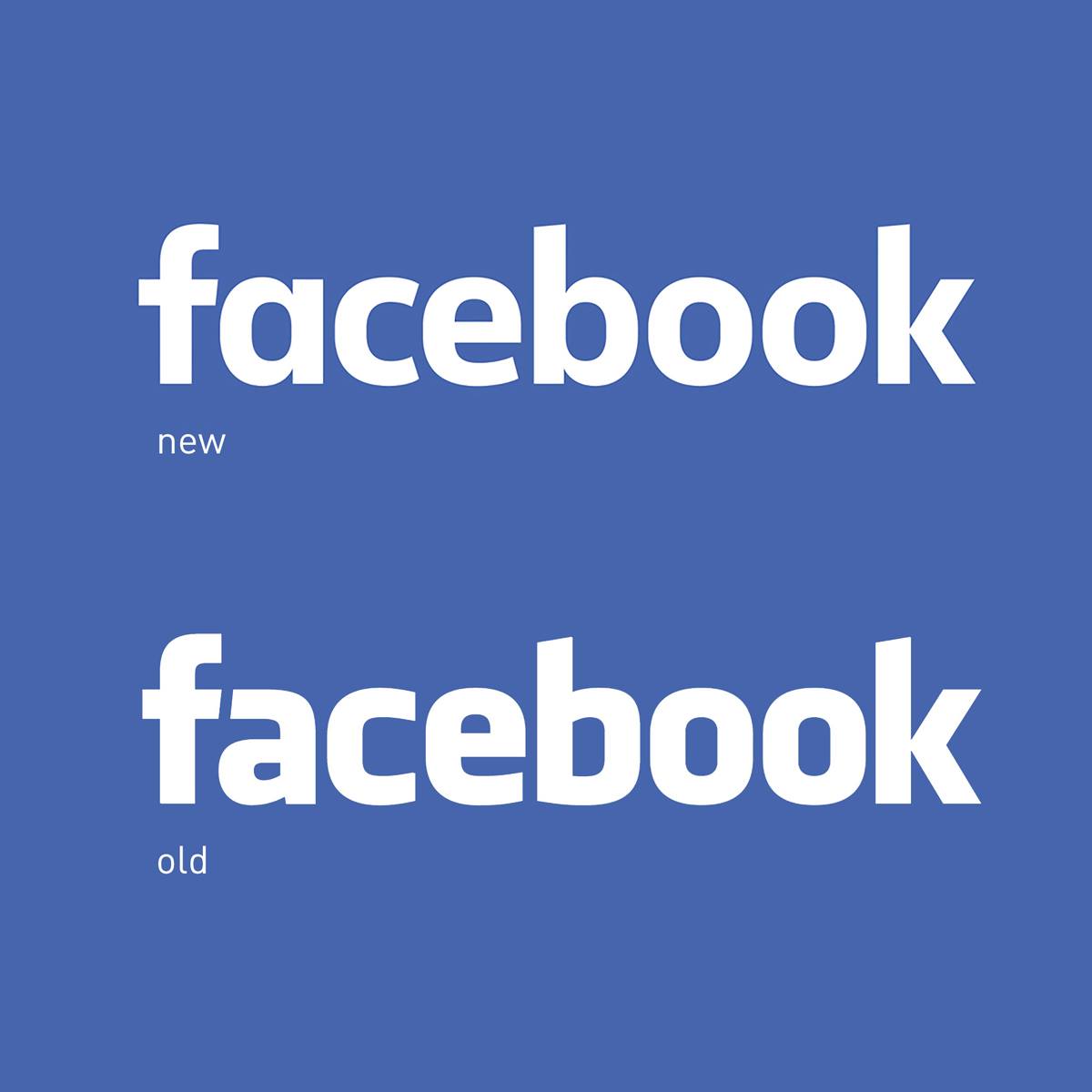
The most popular social network website, Facebook, has changed its Logo... A minor change to the logo's font, However, you will still see the iconic "F" logo that one doesn't change but wherever else the full name is used, you will eventually see a new wordmark designed in collaboration by Facebook's in-house design team and Eric Olson of Process Type Foundry.
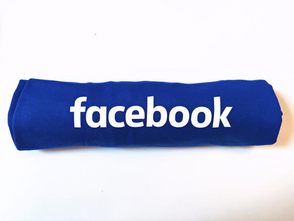
Facebook's New logo used a font which is more simple, here's what the facebook team said about this new logo:
When Facebook's logo was first created in 2005, the company was just getting started and we wanted the logo to feel grown up and to be taken seriously. Now that we are established, we set out to modernize the logo to make it feel more friendly and approachable. While we explored many directions, ultimately we decided that we only needed an update, and not a full redesign. We worked with Eric Olson - whose typeface Klavika was used in the original logo - and developed a custom typeface to reflect where we are now and where we are headed.
- Josh Higgins, Facebook Creative Director
© 2023 YouMobile Inc. All rights reserved

